Value-add industrial & office, nationwide · HaydenCRE.com
The mark is a slab-serif “H” built as two pillars joined by a beam — it reads at once as the initial and as architecture: columns for stability and permanence, echoing the Chapman “Pillar” tone and the firm’s institutional pedigree. Use the keyline crest as the primary mark; the filled tile for apps, avatars, and favicons; and always pair with the Fraunces wordmark in the lockups.
Clear space: keep at least the width of one stem around the mark. Minimum size: 22px (filled tile) / 28px (keyline crest). Don’t recolor outside the palette, stretch, add effects, or place the keyline crest on a busy photo — use the filled tile there.
A Chapman-derived palette. Chapman Cardinal is the single brand accent — used with intent, never as filler. Panther Black anchors type and dark surfaces; warm Sand, Pillar, and Cream give the brand a grounded, premium warmth that separates it from generic corporate blue.
Fraunces (serif) for display, set light — weights 300–400 with tight tracking (−0.022em) for an editorial, institutional feel. Inter (sans) for body, data, and UI. Labels are small, uppercase, and widely tracked (.2em). In Office documents, Cambria and Calibri are the drop-in equivalents.
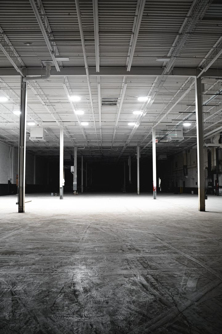
Real estate, not people-in-suits stock. Favor architectural and industrial subjects — warehouse interiors, glass towers, construction, skylines — shot wide and moody. Every image carries a duotone overlay (ink → cardinal, ~15–40%) so photography reads as one cohesive family and never competes with the type. Source from Pexels (free, commercial license) until owned photography exists.

Hero · industrial
Statement · office
Lease-up
Market · skylineDo: wide, architectural, low-key light, duotone overlay. Don’t: bright generic stock, staged handshakes, people-forward imagery, or raw full-color photos without the overlay.
Direct, understated, credible. Short sentences. Strong claims backed by specifics. The confidence of people who already know where the tenants are going — grounded, never promotional.
Near-square corners (1–2px), hairline borders (#E4D8C6), numbered sections (01–06), and thin cardinal rules. Motion is restrained and purposeful: fade-and-rise reveals on scroll, count-up statistics, a slim scroll-progress bar, a nav that turns solid on scroll, and subtle image zoom on hover. Cardinal drives the primary action; ghost handles secondary.
Elements fade + rise 22px into view on scroll.
Stats animate from zero when the band enters view.
Images scale 1.05× under a fixed cardinal overlay.